On Camera: Alexey Brodovitch and Vermeer

The British poet Leigh Hunt once wrote, “Wit is the clash and reconcilement of incongruities; the meeting of extremes round a corner.” This is one of my favorite quotes. I applaud the truth of it. And whenever I read it, I think of a rather unlikely personage: Alexey Brodovitch.
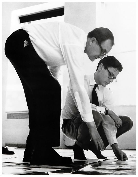
Alexey Brodovitch (left) and photographer, Richard Avedon (right).
Don’t know who he is? Don’t worry, dear readers. I wrote an entire thesis about him in college. Alexey Brodovitch was the art director for Harper’s Bazaar from the mid-1930s to the late 1950s. He had tremendous impact on framing America’s art culture during that time. Many art historians might quibble with me on this one, but I firmly hold to this belief. In nearly every layout, he showcased a perspicacity and innate aesthetic understanding of the dynamic modernist movement that swept in from Europe on the cusp of World War II. However, he understood that each art movement was built upon the previous one. His work clearly reflects his belief that to truly see into the future of the art world, it was necessary to stand on the shoulders of the artists of the preceding one. It was through his tireless effort of reconciling this belief in his work that the modernist ideas cultivated in Europe from the turn of the century till the 1930s were introduced to and ultimately accepted by the American public.
How you might ask? Well, from an unlikely source. A fashion magazine. Alexey Brodovitch wielded his artistic influence from the drafting board at Harper’s Bazaar where he was artistic director for nearly 20 years.
Brodovitch migrated to the United States in 1930, finding employment at the Pennsylvania Museum School of Industrial Art. In 1934, Carmel Snow, chief editor of Harper’s Bazaar, hired Alexey Brodovitch as art director. He approached Harper's knowing he held a position of influence for America’s commercial industry as well as America’s art culture. He used this platform for the purpose of actuating the modern arts and graphic design principles in America.

As many immigrants fleeing the growing conflict in Europe understood, America was on the brink. She had not yet forged out her artistic and aesthetic identity. She was young and, in her youth, she was vivacious and willing to embrace the ideas of tomorrow rather than obstinately maintain the venerable and sometimes fractured principles of old. Recognizing that America fostered an environment for the creative spirit to thrive (just look at the ingenious works she embraced by Frank Lloyd Wright), Brodovitch stepped into his art director’s shoes and left his modern footprints firmly imprinted on the pages of Harper’s Bazaar.
One of my favorite Brodovitch layouts comes from the 1940 September Edition of Harper’s Bazaar. This layout- although I prefer to call it a composition- perfectly demonstrates the wit Brodovitch employed for the reconcilement of incongruities. It’s called Sweater Tops, because that’s what’s being showcased in the photos. You know, fashion…
Where to start? Where to start? You see, these layouts have so many layers of depth, it’s hard to know precisely where to begin. I’ll tell you the truth. When I came across this layout, I felt a little like Egyptologist Howard Carter must have when he discovered Tutankhamen’s intact burial site. I had unearthed a well-concealed treasure right there in The Fashion Institute of Technology’s library on the dusty pages of Harper’s Bazaar.
At first glance one cannot detect any hidden messages. However, set a while. This layout is brilliant, an elaborate composition of clothing and art combined with centuries' worth of visual and aesthetic vocabulary. And it’s saying something very powerful.

The layout spans two pages. The image on the left hand page shows a model, dressed in modern, elegant fashion- a long flowing dress with a cheetah stole over her shoulders. She is looking up at a window through which streams abundant light. She is positioned toward the right side of the page. Central in the composition is a painting by Pablo Picasso from his Synthetic cubism period. In the far right is a leather armchair reminiscent of a 19th century Louis XVI armchair cradling a cheetah fur muff on its seat. A table juts into the frame from the left, covered with a tablecloth, atop of which are two 17th Century trinkets, a piano forte shaped music box and a jewelry box, as well as a pair of gloves. The remainder of the wall is blank allowing the composition to breathe.
On the right hand page, the model is seated in a chair covered in tapestry fabric. She, also dressed in modern garments, is leaning on the table looking at an old globe. A bolt of fur drapes off the table. In the background, directly in the middle of the image, is a collage done by the analytical cubist Juan Gris. Again light pours into the room from a window on the left.

Woman with a Pearl Necklace by Johannes Vermeer. (Little tidbit here, but I did a watercolor rendition of this painting while in art school. It's currently hanging in my guest bathroom.)
This layout is a direct homage to the 17th Century Flemish painter, Johannes Vermeer. The right image reflects Woman with a Pearl Necklace and the left parallels The Astronomer. Brodovitch’s juxtaposition of these classical compositions in relation to the modern art of Picasso and Gris and the contemporary fashion of Hattie Carnegie reveals the thought behind the pastiche composition. It speaks on multiple levels and Brodovitch’s wit is the salt of the visual feast. First there is the obvious comparison between Vermeer and Modernism, specifically, Cubism. However, there’s another element that I’ll point out.
In the 1940s, Vermeer was held in highest esteem by the art community for his compositions of all things domestic and his skillful execution therein. However, when he was alive, he was not considered a brilliant innovator. Rather, his livelihood depended on finding a benefactor to commission his next painting. He lived from painting to painting, or in our modern vernacular, from paycheck to paycheck.
Likewise, many people outside of the art community at that time (as well as today, believe it or not- modernism is still highly contested) remained skeptical about the analytical and synthetic cubism of Picasso and Gris. They were inclined to cast aside the modern art movements as mere child’s play with no value in the art community. However, Brodovitch’s juxtaposition makes it quite clear that these art movements are not only rooted in the principles set forth by the masters of old, but that they aren’t going to fade like the mere whims of mad men. Modernism is another pillar in the Parthenon of the art world, incapable of destruction no matter the artillery used to raze it.

The Astronomer by Johannes Vermeer.
The choice of Vermeer for this composition is witty. How so, you might ask? Well, I’ll tell you.
Unlike the plethora today, in the 1940s, photographs were rarely seen in magazines. Artistic clairvoyant, Brodovitch harnessed the new technology and gave free reign to his photographers (imminent names such a Richard Avedon, Irving Penn, Man Ray…) to explore the possibilities of this new medium. This was a rather controversial stance to take.
Now, you may not know this, dear readers, but Vermeer was controversial in his day, too. He utilized the first photographic device in his painting process. Vermeer used a camera obscura to help frame his composition. Referencing Vermeer in this layout adds a witty twist to the whole. It puts a smirk on the art historian’s face and highlights the fact that Brodovitch was more than just an art director for a fashion magazine, but a sedulous adventurer at Harper’s Bazaar, a savant in the art community, a ray of enlightenment to the benighted graphic designers in America.
Just as Vermeer’s paintings (composed with the help of a camera) were true art, Brodovitch is subtly saying that photography is a true art medium. In his mind it was not sacrilegious to juxtapose photos with Vermeer paintings. He believed that one of the next major changes in the art community was already underway: photography. By paying homage to the masters of old, but doing so in a thoroughly modern way, he was beginning to bridge the gap for people even if they did not realize it. And, he was able to infuse all this newness with the fun and frivolity that fashion allowed for; he deconstructed Art, with a capital A, to approachable art for the layperson. It didn’t have to be stuff and displayed in a museum. It could be in the everyday.

In fact, Brodovitch’s collaborative cooperation with such forward thinkers as Carmel Snow and Diana Vreeland, Harper’s fashion editor, had such impact on American culture, there is even a movie that pays delightful tribute to them: Funny Face. It’s a musical starring Audrey Hepburn and Fred Astaire. Hepburn is the unlikely discovery of fashion photographer Dick Avery (clear reference to Brodovitch’s right hand man, Richard Avedon). While the story focuses on their budding romance, it is important to note such tips to Harper’s Bazaar in the inclusions of the strong female presence of Maggie Prescott (homage to Carmel Snow) and the art director Dovitch (a little on the nose, but definitely a salute to Brodovitch). If you haven’t seen it, it’s a fun romp through fashion, and the director adhered to the feel that Brodovitch captured in Harper’s Bazaar. Very modern and a whole lot of fun.
Who’s your favorite personage within the art community? I’d love to hear about him or her.
Post Script: I have such admiration for Alexey Brodovitch that I named one of my characters in my second novel after him. Well, I didn't use his last name. But there is an Alexey in my as yet untitled second book.